This image is an image that I found off of Google depicting many road signs in britain.
I also researched some funny road signs and I came across a photo on Google that I recreated in photoshop.
I recreated the image because the photo that I found wasn not very clear.
I thought to also research some funny signs, because there may be some humour in the way signs are placed or read in my game. This is something I have not yet decided.
This is a sign that I created in photoshop for my game.
This sign is a directional sign and will be used as a clue.
I did it in this style because I think that it is very natural colours. I blured out the background becaus I wanted to show some depth of field. I think this is effective for close-ups in the game because it helps to focus on the main points.
This image is a guide to the meaning of the shapes and colours of road signs. This was helpful for me in my reserach of road signs.
Dartmoor is an area of moorland in south Devon, England. Protected by National Park status, it covers 954 square kilometres.
Parts of Dartmoor have been used as military firing ranges
for over 200 years. The public enjoy extensive access rights to
Dartmoor (including restricted access to the firing ranges) and it is a
popular tourist destination. The organisation responsible for tourism on Dartmoor is the Dartmoor Partnership.
At 368 square miles (954 sq km) in area Dartmoor is the largest upland
in southern Britain. Millions of people visit it each year for its
dramatic landscapes, varied habitats and wildlife, and cultural
heritage. There are some 17,500 protected archaeological remains dating
from the bronze age, through the medieval period right up to a recent
industrial past. Dartmoor was designated a National Park in 1951.
Personally this was the best line drawing image that I have seen so far. I like the composition between the line drawing in process using delicate lines and the rendered version. I like the colours used in the rendered version also because that also is a HUGE contrast between the Black paws and the methods used to shade. I thing that water colour works really well with this image because it makes a delicate and dosile effect. This image was found on Google and drawn/ painted by an artist called Roz McQuillan.
I REALLY like this piece. I think that the colours and the style fits the sadistic look on the face depicted. The person has used ink to draw the image and uses tighter scribbles to exagerate the shadows. This image being as plain as it is still creates an unsettling feeling to it and the way it is styled. They have just used the shade of black and have thought about the placement of all the scribbles. This piece was done by Daniel-Mathers.
I like the really simplpistic way that this image is done. They haven't used shade nor colourr. But yet they can still depict a really obvious image. And in opinion this image is either depicting people falling out, or people growing apart. Either way that style they have used is very modern and easy to see with the contrasts.
This image was done by an artist called Charles Avery.
I like this piece because it is an amazing play on perspective. I really like this piece because I think that it is clever and somewhat eye-catching. It makes people think since it took me about 20 minutes of looking at it to realise this image was about perspective. This image again is very simplistic with shade and colour also the shape is somewhat simplistic. There is only a sillouette of a person with crazy hair. But this hair could have swirls in it, instead of too much detail the artist just used straight edge lines.
This image was done by Paul McClintock.
This line drawing also is a play on perspective when you seen that the top of the persons head is larger and more bulbus that it should be. Yet his face and body narrows as it gets lower down the image. They have used three Shades for this image, those being, White, Grey and Black.
The artist has used a combination of lines and dots to fill all of the negative space in this image, I see that the use of dots are more so to shade though.
This image was done by Ultima Thule.
This image uses a technique called spot colouring which is commonly found in photos.
I think this makes the style of this image more Pop styled. This image uses the descreat use of colour effectively. I like how the black and white image s styled to kinda look a little like traditional drawing yet the Lime is more Vector sorta images. The combination of the two brings out this modern taste to the image.
This is an image that I made using the experimentation of cubism.
I made it in flash using the photo I originally had as reference.
I didn't add any round lines like the typical cubist image and I made the perspectives flat.
Possitive- I think I like the surreal effect in what I did in this image. And I like the emphasis on the shadows.
Negative- I think maybe I shoud have put more ime into this picture and maybe did it in traditional art to make it more original.
This is now an image that i have done using the style of Pop art based on the reserach that I have done on Andy Warhols work.
I got the original image and changed the Hue. Then I duplicated it and changed the Hue again. And then did that over and over until I got image that I have now. I also lowered the saturation a little on the image so that it will look some what of the same colours as the one that I researched.
Possitive- I like that the colours worked so well and feel I will use this technique again some time soon.
Negative. I think that maybe I should have chosen another picture as I have used the same in another example.
This is the collage technique that I tried out. I was making the sack boy toy unusual sizes to make the man look strong for carrying it. It wasn't very easy to do because I wanted to use a the same image to show how it can be used in different ways in the style of these art pieces.
Positive- Works really well and can tell what style I'm trying to do.
Negative- I think I should have done more to the image to fill it out more.
This is one angle of the three different angle sketches. I drew a picture of A Sack Boy Plushie.
I drew lines instead of the full detail of the stitching because it would have been confusing to have every exact detail. I also made the lines round to emphasize the shape of the sack boy.
This is a Photograph of the Sack Boy plushie that I was drawing.
I took this picture as best I can with the little materials that I had because I wanted the image to be minimal editing and I wanted it to also be presentable for this blog.
This is a vector image of the sack boy that I drew based on the photograph as my second angle.
I did this because it was just suppose to represent the colours that I see in the source image. I like the boldness of this effect and feel that it would be good for a game style possibly.
Possitive- Simplistic and suiting.
Negative- Probably should have used a different image of the toy rather than repeat the one that I have.
This is the original tree stump that I took on Dartmoor On a Canon EOS 450D.
I took a picture of this stump. Because I felt that it would be perfect for my Character to sit on in the game maybe.
This is a drawing that I did in photoshop of the tree stump image that I took on the trip to Dartmoor.
I did this image digitally rather than traditionally because I prefer that style. And I like the colour contrasts and strengths.
I did it natural colours to contrast with my Character possibly sitting on it. I wanted to make her sitting there to be very visible.
This is an image that I manipulated from the Dartmoor trip. I made it as a clue and I chose the colours to be VERY close to the original image. I just changed the words on there and made it more animated and suitible for a childs game.
This is the original image that I took a picture of on a Canon EOS 450D.
This is one of the close up image that I had to draw. The original image was of a fly.
I did this mainly with paint brushes and the pen tool.
To do the eyes I started with a straight black line. Then I erased little bits to make it look like a dot. I then duplicated the dotted line untill i had enought to cover the lines. Then made them for both eyes.
Once I had done that I used the bulge tool in the liquify window to make them some what round and bulbus, then I duplicated the picture, selected it and went Edit> fill> 100% white. This was pretty effective for getting the effect I needed in such a simplistic way.
Positive- Looks just like the picture I immitated and the brushes I used were really effective.
Negative- I think that i should have done the image to be even more closer to the flies face, then it will be an extreme close up of the flies eyes and then I could have possibly have managed more detail in the image.
This is a plant drawing close up that I drew on paper then imported into Photoshop and edited in some colour and grass and just made my own adaption to it.
I did it as a traditional sketch at first because I didn't want the temptation of trying to make, say a digital image to look JUST like the source image. I wanted to create my own enterpretaion of the shape by exagerating the shape and size of the leaves and also making the shadows a LOT darker than they intended to be, just so i can show a lot of depth in the image.
This is the original image of the growing plant.
This is also an image that I drew digitally on flash based on the actual photo and not my sketch.
I did this so I could show the composition of the colour and I also included some bold grass at the bottom with different shades of green to exagerate depth and light.
This is a close of a Lady bug that I produced with a Graphics tablet on Photoshop CS5.1.
I intended to put a little more effort in this image but I wanted to also focus on some other work. I think also I should have done a close-up of it even further into the photo because I wanted to work a lot with extreme close-ups.
Compared to the original photo I think I am actually proud of this drawing. I have included a lot of detail. But nearly enough as I wanted to.
This is the original photograph that I found off of Google.
This is the character that i have come up with for my game concept.
She is a fairy and she is constantly getting lost.
It is up to the player to find her by going to different locations, Finding clues, Encountering obstacles and finding away around the obstacles.
My character is a fairy because when I researched myths and legends about Dartmoor I found a few stories about people seeing Pixies. And this inspired me to have a fairy as a character, Because they are very similar creatures.
I found an image of a pixie in google images and i like the style that it was drawn in and found a picture of a fairy and got a picture of the famous fairy, 'Tinkerbell'.
I have not thought of a name for this character yet and I haven't created other characters. But that is on my list of agendas.
I think that because of the nature of the game and the style of the drawings, ect, This game will be aimed either more at younger children or girls. I want to introduce a male character to this game too so that it is not too one sided. I like a balanced game and the chance for the player to custom there preferences.
This is a front shot of my character.
I did this in a more simplistic style to the original concept. Because these are just concept ideas of what they will probably look like.
I did it in this style also because it was easier and faster and gave me more time to also focus on other things to work on.
This is a picture of the character in the game sitting down.I am planning in making this the image to combine with my tree stump image.
This is the action shot of the fairy flying. I want this to be what the character does when she is found. She will fly verticaly into the air and shout "You've won!!!"
This is the fairy sitting on the stump image that I manipulated. I like this because of the contract of dark natural colours mixed with the bright colourful fairy. this is exactly the effect I was originally trying to go for.
This is how the image will look roughly once the fairy is found and she is in clear sight. She will have stars flickering arouns her because I think it is a nice touch and adds effects. Considering the typical fairy is seen to have a glow around them and "Fairy dust".The quality of this image isn't that great because I exported it from Flash CS5.5. I did this because it was easier than uploading it to Youtube to show case on here.
This image shows the two image I used as a refence into drawing my final Fairy.
This shows the stages in drawing and colouring this image too.
This video represents a token that will be the clues inside this game.
These little stars will appear wheen the fairy is near and you are close to finding her. I intend to make it at the corner of the screen so that when you become close to her the little star clues become more intence and start to flicker, Ect.
This image is suppose to represent the little icon used on a health bar. This one is designed for if a girl was playing. I made it so that they were more gender friendly just in case any male people decided to play this game.
I've made it Plain and simple for the boys to play because it is hard for a boy to like a game if everything is just for the girls, Ect.
These are the rendered health bars that I designed for the game.
I did the one for boys as blue and the one for girls as pink. I did it this way because I wanted this game to be a little farer. And well anyone can choose any gender to play. I chose this idea because I like the idea of personalisation in games. A lot of the games that I play for example the Halo games have interchangable Suits of armour and amour colours, Even badges. And I wanted to some how get that idea into this game. I like this idea also, because it shows individuality and also personal reference.
This is how it will look during game play.
There is also a directional compass at the bottom of the screen with an interactive location spot to give some clue to the player as to where the fairy they are looking for, is.
Positive- I think that it is a good technique to seperate gender and allow them to choose their preferences.
Negative- I think that in the male compass I should have used a diffent style of writing to suit the type of player.
This is what it will look like roughly when the player is losing lives in the game. I kept it to red crosses because of my Sign research as red is somewhat a sign of danger and then I used my common knowledge of crosses being known as a mark for something being done wrong. This is why I kept it that simple, because it is a game designed for kids and I want it to be as easily percieved as possible.
These two images are experimentations that i have made with fonts and text that will potentially be the title for the game concept that I am designing.
The reason i like the first one is because it is nice and easy to read with a small design on one of the letters I like this because fairies are know to be very natural and a lot to do with leaves and branches, Ect.
I also like the second one because it is funky and also easy to read and more child friendly. Where as the first one seems a little bit more mature or for teen magazines style.
This is a collage of all the photos that I have taken on the moors..
All pieces in this collage will be involved im my game.
I made a collage because
I took this image because I thought that the game concept idea I wanted to go for will be in a sunny enviornment. I was just lucky that it was sunny to take this image.
The concept of my game is finding Pixies, Based on the myths and ledgends of Dartmoor. This is why a lot of my images are close ups on small objects. To depict observation.
This is the image I found upon our artist research of ordanary objects. But I feel that this image did not inspire my work in any way.
The way that this artists has used an every day object, is made it smaller and put it in the hand of a guy considered to be "ripped". This emphasizes his strength and makes him looks stranger than he really is.
I like the pop art magazine look to this piece and the collaging technique. I feel that this will be better off for poster ads and magazines.
I didn't really feel that this image by Piccasso was any inspiration to my work either.
The way they have emphasized the shape in this artists painting is by using a technique called cubism I think that cubism is very effective for surrealism and modern tasted. But taking a round object and making it out of straight edges. Also taking the different perspectives that can be seen and turning it into a flat interface.
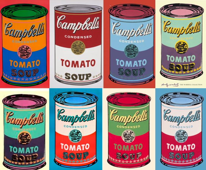
In pop art the colours are changed into different versions of it's self. In my opinion I think that the colour changes represent Alter egos and it gives a slight cheeky effect.
I think the way this object is used will probably more also used in advertising. I like the bold colours and I feel that maybe what draws people into it.
The artists on this one has definately emphasized the size of this apple by making it an unusual size in a 3D medium of sculpture. I think that this is effective and quite ironic in the way that it is sized.
I think that the way that the object in the picture is exagerated, is through colour. It is quite clear that in this picture that the image is suppose to be a Golden colour but in the picture it is yellow. Rather than paint all the reflection and the detail that a shiny surface needs...
They have just coloured it to be a solid yellow. They have also thought about darkening parts of the image so there distictive from the rest of the picture.
INDESIGN TUTORIAL.
First of all we had to make the image suitible for the web. The image to the left shows that I have added an image and resized it And added text.