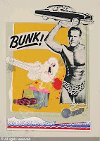
 This is the image I found upon our artist research of ordanary objects. But I feel that this image did not inspire my work in any way.
The way that this artists has used an every day object, is made it smaller and put it in the hand of a guy considered to be "ripped". This emphasizes his strength and makes him looks stranger than he really is.
I like the pop art magazine look to this piece and the collaging technique. I feel that this will be better off for poster ads and magazines.
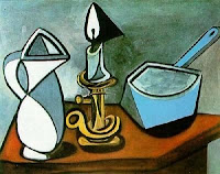
 I didn't really feel that this image by Piccasso was any inspiration to my work either.
 The way they have emphasized the shape in this artists painting is by using a technique called cubism I think that cubism is very effective for surrealism and modern tasted. But taking a round object and making it out of straight edges. Also taking the different perspectives that can be seen and turning it into a flat interface.
In pop art the colours are changed into different versions of it's self. In my opinion I think that the colour changes represent Alter egos and it gives a slight cheeky effect.
I think the way this object is used will probably more also used in advertising. I like the bold colours and I feel that maybe what draws people into it.

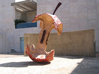
The artists on this one has definately emphasized the size of this apple by making it an unusual size in a 3D medium of sculpture. I think that this is effective and quite ironic in the way that it is sized.

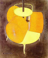
I think that the way that the object in the picture is exagerated, is through colour. It is quite clear that in this picture that the image is suppose to be a Golden colour but in the picture it is yellow. Rather than paint all the reflection and the detail that a shiny surface needs...
They have just coloured it to be a solid yellow. They have also thought about darkening parts of the image so there distictive from the rest of the picture.
INDESIGN TUTORIAL.
First of all we had to make the image suitible for the web. The image to the left shows that I have added an image and resized it And added text.


No comments:
Post a Comment